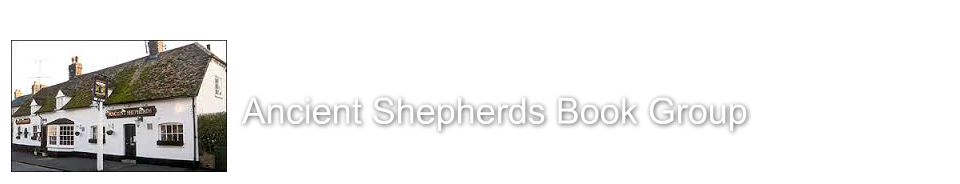
Venue is for most new members. The picture shows what the member can expect from the venue, location, etc. Also the picture are nice addition to the website (kindly given permission to use by the landlord and landlady of the Ancient Shepherds public house).
Discussion page is key to helping create a community, and keep regulars coming back.
Local libraries and book sites page. One of the key things to come out of the survey was a need for this page. As such I have linked to the local library service webpage, online registration and library e-books.
With this I have also included links to online book sellers, and e-books to providers.
Local Info. Lastly this is local group and a local service. Linking the group and the website to other local groups and services was important on the survey, and also in my fake testers. As I'd done several maps already, so wanted something a little different. With this final map I wanted to highlight some local bits, but also the nearest public library and also the nearest bus stop, if someone was travelling by public transport.
Topic: Discussion
Construction part 4
Richard Parker | 09/07/2015
Construction part 3
Richard Parker | 09/07/2015
News and Up and Coming events aren't ideal. they duplicate each other and they are far from perfect. The reason for 2 pages I wanted to have a Twitter feed, but couldn't work out how to use Webnode to get it in on the Up and Coming, so I duplicated the page. The Twitter feed I feel is more regular and better at keeping the site current.
Gallery is mainly making the site attractive, and good for new users. The pictures were either my own, or copy-right cleared.
Book reviews was there for regular users, to get them coming back and also to help kick start discussions.
Construction part 2
Richard Parker | 09/07/2015
Homepage.
With the users in mind, the home page was the front page of the website. It had to be clear, attractive and uncluttered. My aim for the website's home page it need to look interesting enough, but with just the key information for all users, but especially for regular user, who just want what and when.
As such the front page has contact information, the latest group meeting date, latest news (which will feed from the news page).
About Us
Was focused on the new or recent member. It was to state how it all works, but is also friendly and to give an idea of what the group is about.
Construction part 1
Richard Parker | 09/07/2015
After familiarizing myself with Webnode, getting the content ready, structure ready, and testing it using my fake users; I felt I couldn't put off construction any longer.
I tried several Webnode templates. Finally settle on this one, once I worked out how to remove most of the graphics and add my own. (but somehow not the sea shell, which I can't remove!). I felt the look was clear and attractive. I'd looked at other book group websites. Many were cluttered, and the best ones seemed clear, simple and bright. As such I wanted a similar look to this website. After looking at some other templates, where there was allot of red, this seemed too aggressive for book group. The whites, greens and blues seem clean, but friendly.
Website development part 5
Richard Parker | 09/07/2015
With the survey and my five users in mind, plus my reading, I used the post it notes to set down my pages, what would be on them, and their priority.
I then found and learnt how to use Webnode. This was more challenging than I thought.
I found the software far from intuitive, and it was difficult to find a design that I felt looked nice, clean and effective, but also could be used the post-it-note layout I had was playing with. Webnode offered a very flat structure.
As such I went back to my post its. A change my plan a little, reducing the pages liking to each other. In fairness this was only applicable to a couple of pages.
So I decided that the Home page would have all the basics on and would be the first page. This would suit the regular user and member.
About us was next and was there for the new user, to welcome them and tell them a little about the group.
Contact page was for everyone, and the contact in formation from it would populate other pages. There would be basic google map on it for quick reference.
Next would the groups News, but also a feed from the London review of books. Again something that would make long time members come back, and also keep new members updated.
Photo-gallery was for the new comer to the village or someone not local, just so they could get a feel for the village. Also it was nice to add some pictures to the website.
Book reviews linked to a major online website where people review books. This could help with discussions, and give new users an idea of if the book being read was on that attracted them. It was also area that the survey highlighted as being of interest. Also It included the books for previous years and their ratings.
The venue, was good for new users, as they could see this was pleasant place to have book group. Certainly a pub that was rough might put people off, as such these section told them something about the location and the quality of the pub.
Discussion was a chance for people to exchange views before or after a discussion. Also it was an area for users to make the most of. Again long term members might be keen to come back to see who's posted recently etc.
This page on local libraries was important. Not everyone can afford every book, and so how to join the local library, its website and the nearest library were included for all users. Also there were links with online retailers and eBook suppliers.
Lastly for new users, a more interesting map, as we have several basic ones planned already, and links to the local community.
Website development part 4
Richard Parker | 09/07/2015
Reading back some of my posts, its clear my dyslexia has been quite impressive. Sorry for sentence structure and spelling.
I Read the appropriate sections of the Head first Web Design book and some of the web style guide.
I pulled together the answers from the survey, which highlighted that Facebook was not of any interested to the users.
Using post it notes I set out the sections I was planning to use (see the set up of the website about) and looked at how, with survey and my fake users they would approach using a website for book group.
I create several fake users:
1. Long time member just wants to know what book is next and what date the meeting is. They want to find key information fast.
2. A person looking is this group is right for them.
3. Some who new to the village who is interested in joining, but know what else is happening locally
4. Someone outside the village
5. A member, but who for whatever reason may not be able easily find the book being read.
Website Development Pt 3
Richard Parker | 07/07/2015
After reading the recommended text on web design, plus some online articles I had telephone conversations with the two group members.
Post this I wrote out paper version of the website I was thinking of post this part of the research. Most of the current areas of this website were included, pluse 1 for facebooks pages, and some other more general pages.
I already felt the more general pages about book groups, and links to other book groups were not that well for teh users.
I also tested my site using my made up users.
I found that the more general information and the book group lists, were not useful or and more not likely to be looked at, except for someone locationg another book group closer to them. So I refined the quiz questions, dropping general information and book groups, but leaving Facebook in.
At this point I wanted to test if the website would appeal to the wider group so I created and sent out this survey:
https://www.surveymonkey.com/r/V8NNND6
website development Pt 2
Richard Parker | 07/06/2015
So I re-thought my plans and undertook some further reading.
Though the remit suggests a totally mythical organisation to develop a website thought, I wanted the time an effort to be of value.
So I approached my mum, who set-up and ran a local book group in the village. I felt that post the marking of the site, I could look to pass on the website to the management of my mum, or my sister-in-law, to maintain and continue the website. (and edit it as they see fit).
So the ownership of the copy-right was held already by someone, who would not object to me taking it, so I had no need to fear breaking it, or hunt down if someone has a duplicate site.
Secondly this provided a chance to discuss the site with actually users of the website, and I would mix that with some of my own created profiles.
As such I would speak to the chair of the group (my mum) and discuss what she would like from a website.
Then my sister-in-law, a long time member of the group, would also be a good person to interview.
I was then able create some profiles to test for website.
1. A person not familiar with the group, and looking to join a book group.
2. An irregular member. Not there every month, turning when they can or when there's a book of real interest.
3. A member new or longer term, but coming from a distance, e.g. not in the village
4. Someone looking see what's going on in the group, in the context of the wider village.
Lastly once I an idea of what the website might look like I had permission to use the email addresses of the existing members, to send them survey monkey quiz, asking their ideas about what I was suggesting, and (maybe more importantly) what I missed.
website development Pt 1
Richard Parker | 07/06/2015
This my first posting regarding this website and its development.
I started my plans for this website during the reading and of the module text. My initial thoughts were to develop a website for the a mythical cricket club for the village in rural Cambridgeshire I grew up in. I got as part as developing a paper structure and considering some invented test users.
I decided, as it would be a community website, that the site would link to other websites in the village etc, I Google and see what existed in the village. On the returns for the results, one of the top sites was one for the Fen Ditton Cricket club! So it was back to the drawing board.